Mega Menu
The mega menu for Litres, a reading platform with 12M users and over a million titles. A discovery surface built on one idea: search and discovery are different needs.
The mega menu for Litres, a reading platform with 12M users and over a million titles. A discovery surface built on one idea: search and discovery are different needs.

YEAR
2022
ROLE
Product Designer
SERVICES
Information architecture, navigation design, UX
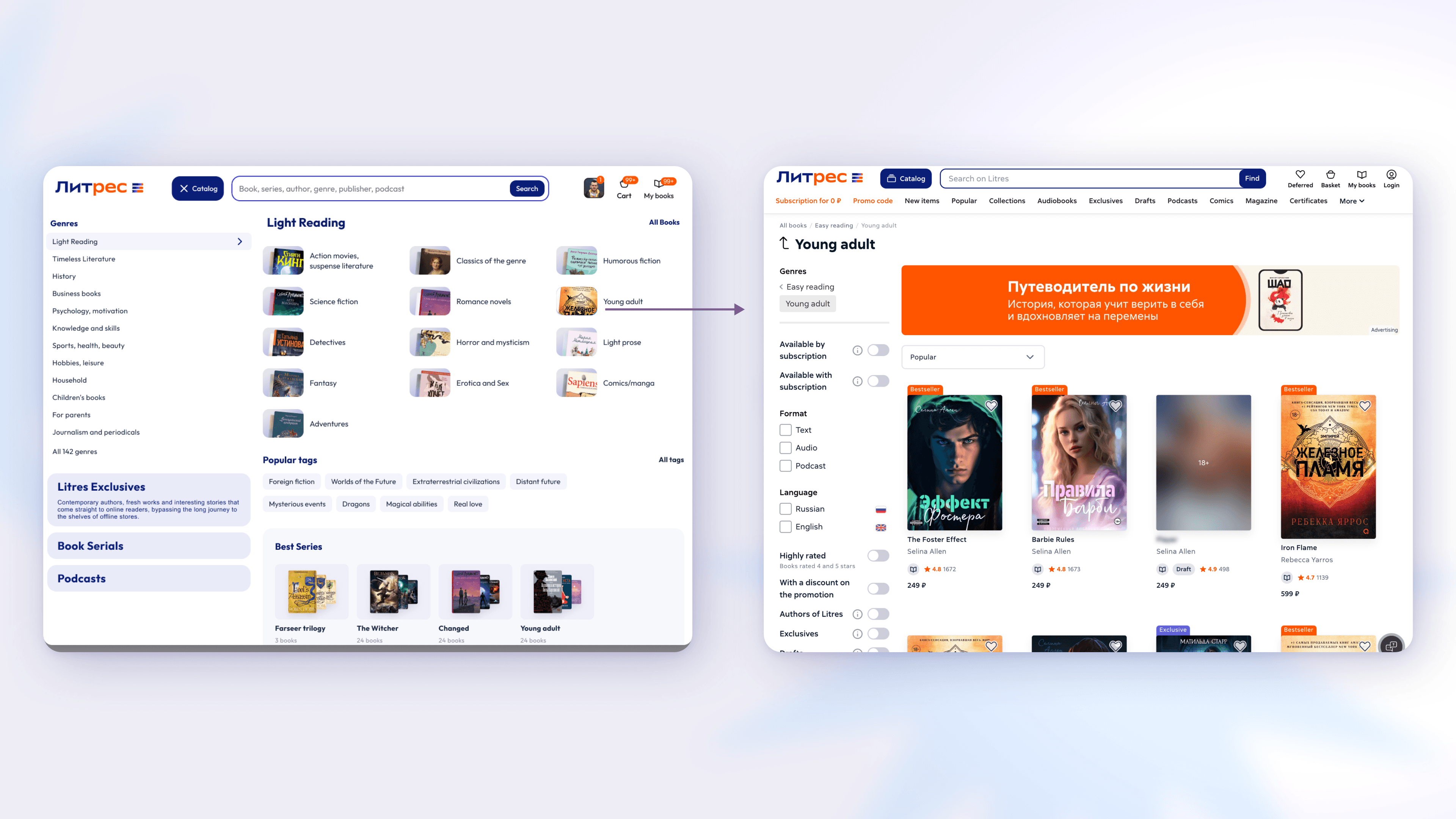
The old navigation was a flat list of genres, split at the top into “serious” and “light” literature, a division that felt arbitrary to us and to readers. We couldn't restructure the underlying catalog yet, so the menu had to make the existing structure work harder, and lay the groundwork for a future reorganization.
Search assumes you already know what you want. Discovery is for everyone else, the reader after something good they can't yet name. With over a million titles, that's most people. The mega menu was built to keep them browsing and finding on the platform, rather than deciding elsewhere and maybe coming back to buy.
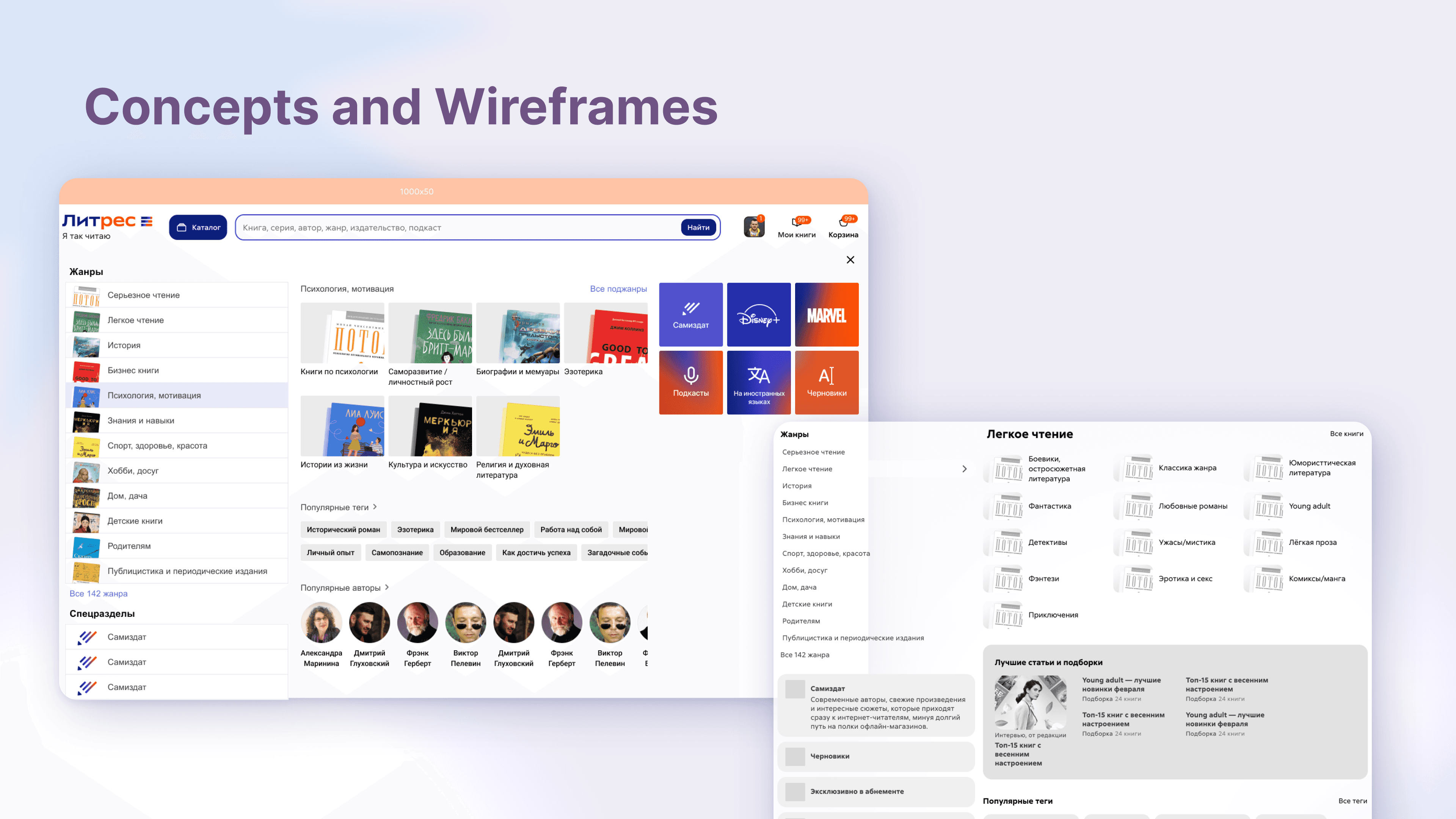
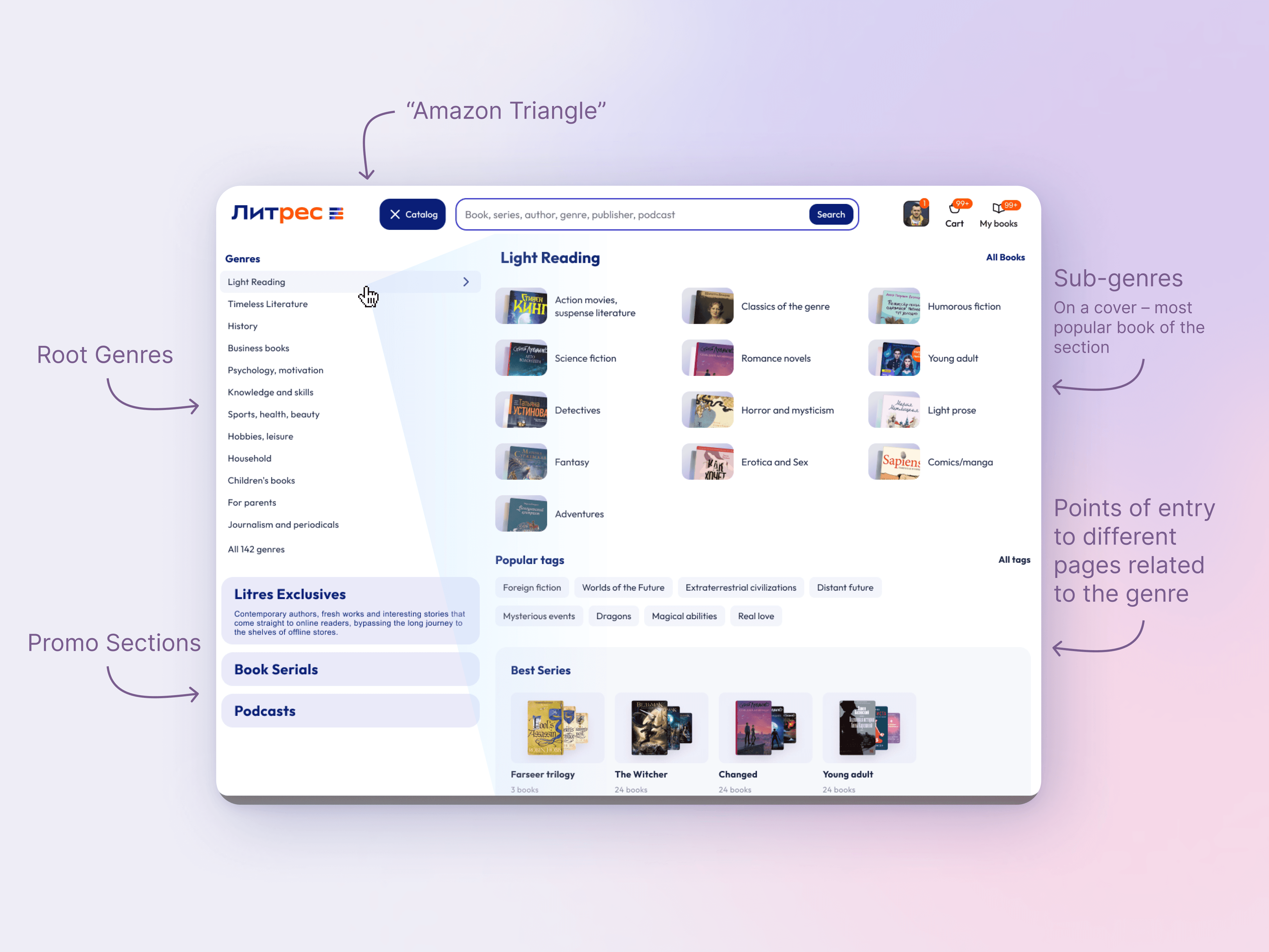
The biggest shift was illustration. Each subgenre showed thumbnails of its current bestsellers, pulled dynamically. That did two jobs: it promoted bestsellers, and more importantly, it showed readers what a subgenre actually contains. You might not know what a label like “dark fantasy” promises, but seeing Stephen King's The Dark Tower under it tells you instantly, the way a physical bookshop does.
Beyond subgenres, the menu surfaced curated collections, tags, and book series, several different routes into the catalog. With 12M readers who all read differently, the goal was to open as many doors as the navigation could hold.


The mega menu for Litres, a reading platform with 12M users and over a million titles. A discovery surface built on one idea: search and discovery are different needs.
YEAR
2022
ROLE
Product Designer
SERVICES
Information architecture, navigation design, UX
The old navigation was a flat list of genres, split at the top into “serious” and “light” literature, a division that felt arbitrary to us and to readers. We couldn't restructure the underlying catalog yet, so the menu had to make the existing structure work harder, and lay the groundwork for a future reorganization.
Search assumes you already know what you want. Discovery is for everyone else, the reader after something good they can't yet name. With over a million titles, that's most people. The mega menu was built to keep them browsing and finding on the platform, rather than deciding elsewhere and maybe coming back to buy.
The biggest shift was illustration. Each subgenre showed thumbnails of its current bestsellers, pulled dynamically. That did two jobs: it promoted bestsellers, and more importantly, it showed readers what a subgenre actually contains. You might not know what a label like “dark fantasy” promises, but seeing Stephen King's The Dark Tower under it tells you instantly, the way a physical bookshop does.
Beyond subgenres, the menu surfaced curated collections, tags, and book series, several different routes into the catalog. With 12M readers who all read differently, the goal was to open as many doors as the navigation could hold.